New web UI for JetStream switches

This thread has been locked for further replies. You can start a new thread to share your ideas or ask questions.

New web UI for JetStream switches

This thread has been locked for further replies. You can start a new thread to share your ideas or ask questions.
New web UI for JetStream switches
2019-10-10 09:44:05 - last edited 2021-03-30 03:58:42

Hello TP-Link,


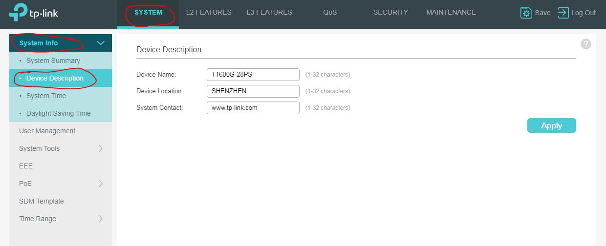
today I had the opportunity to view the new web interface of the JetStream switches.


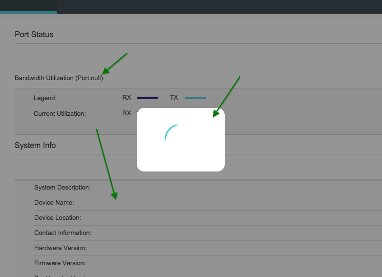
From the point of view of usability, the web UI has deteriorated significantly in my opinion. Especially annoying is the loading indicator when changing pages. A loading indicator is useful for longer loading processes, but not when changing pages, which should be fast in any browser! In contrast, loading pages in the browser is now also slower because of this loading indicator, beside its visual annoyance.


Then I noticed that the clarity of the information has suffered greatly. Nothing against eye-candy, but if you have to scroll to see content like the traffic statistics, it's annoying, too, especially with automatic reload of the page enabled.


Next are unused white areas due to big distances between the lines with the same small font as before. What for? If I want large font, I can enlarge them it in the browser. But with large line heights (unused distances between lines), the useful information then stretches and you again have to scroll even pages with short content. No wonder you need two separate navigation menus now, because they won't fit into one navigation area anymore:


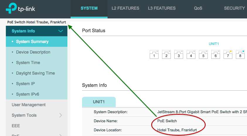
Compared with the old layout of the web interface, the handling in the new interface has worsened in my opinion. Compare the new Web UI with this compact representation of useful information in the old UI's plain functional style:


That's much more compact in my opinion – one can see all important information at once, no scrolling, no eye-candy, no wasted white space, fast page loading. Such a functional layout is way better for daily use by network administrators.


Rule of thumb: A web interface for administrators is a website that should be primarily functional, clearly structured and informative. You don't need to win a layout competition with it.


What leads me to the question: Was the new web UI designed by a web designer who doesn't have to administer switches himself or was the UI changed to be used on smartphones (not serious, are you)?


Anyway, I did downgrade the T1500G-10PS firmware because of this UI accident.


༺ 0100 1101 0010 10ཏ1 0010 0110 1010 1110 ༻
  1      
  1      
#1
Options
5 Reply
Re:New web UI for JetStream switches
2019-10-11 03:20:19

@R1D2 


Hi R1D2


In order to let users find the function more quickly, we change the design of the menu. In the old web UI, users need to find a function between all menus, it's eay to get lost. Now he can choose SYSTEM/ L2FEATURE /L3 FEATURE... then find the function he want. We think this is more friendly.


About the page layout, as you said, it's not as compact as before, but it looks more comfortable.


In total, the change are good or bad, still need some time to adapt it. Very thanks for you kindly feedback. If we have plan to modify the web UI again, we will feedback the issue to product engineers.

  0  
  0  
#2
Options
Re:New web UI for JetStream switches
2019-10-11 09:21:23 - last edited 2019-10-11 10:04:07

Hello Anderson,


thanks for your reply. My comments below.


@Anderson wrote:

In order to let users find the function more quickly, we change the design of the menu. In the old web UI, users need to find a function between all menus, it's eay to get lost. Now he can choose SYSTEM/ L2FEATURE /L3 FEATURE... then find the function he want. We think this is more friendly.


There are different points of view, two are:


- From PoV of motivation any web UI changes for more clarity and visual friendlyness are definitely very appreciated, no doubt.


- From PoV of useability I can only speak from my experience and I see some problems which are very common in the area of web design. Programmers and web designers love possibilities which modern technologies offers (nothing bad here), but often oversee that every technical method is best suited for a certain task. Also, they often are not aware of the most important reason for using a certain technical method: useability and (as you wrote) friendlyness.


As for friendlyness, the collection of menu functions under a handful of main menu items is a good idea. But the way it was done introduces another menu level, so we have four now:

  1. topmost menu above the page,
  2. left navbar menu,
  3. left navbar expansion menu (only some subcategories),
  4. tab navigation.


Why not use the 1st level as headlines in the already existing left navbar menu forcing to expand the 2nd level menu? The 3rd level menu also expands there.


The APPLY button on top is a good idea. Except if you need to scroll down the page to select an item and scroll back again to apply. That's why scrolling should be avoided if possible, but if the page needs to be scrolled, strictly avoid two scroll bars (that's a designer's rule of thumb). The web browser decides whether a scroll bar is needed, no need to use a fixed window inside a page window to force another scroll bar for long lists.


Here is a very quick useability analysis for navigating and changing values/applying changes which tries to demonstrate both points:


The blue arrow shows the user's attention/motion for navigating on pages, the red arrow shows selection of an item / applying the change.


You see: all page elements need to be touched: right page header menu, left navbar, page tabs, scroll bar, item, scroll bar again, apply button. Compare this with the layout of the old web UI. The latter was much cleaner and more friendly IMO, albeit not so shiny.


You could greatly improve this by removing white space/unused areas and eliminating at least one of the two scroll bars (the unneeded one in the inner window, just remove the window-in-a-page-window frame and use CSS for formatting). BTW: this is a very good example of how one unneeded element - the scroll bar in a window in a page window with a scroll bar - destroys friendlyness introduced by moving the APPLY button from bottom to the top.


And please consider removal of the very annoying spinner/loading indicator when loading pages. Pages load so fast, a spinner/loading indicator just results in unneeded visual flickering.


Thank you for consideration, hope you find this feedback from a user/useabilty perspective helpful.

༺ 0100 1101 0010 10ཏ1 0010 0110 1010 1110 ༻
  2  
  2  
#3
Options
Re:New web UI for JetStream switches
2019-12-12 00:13:24 - last edited 2019-12-12 00:27:02

Dear @Anderson,


I have some further (minor) suggestions/feature requests for the new web UI:


1. Dynamic display of port-based settings after port is selected


Assume you want (for example) disable PoE ports 1 and 2. You hover the mouse over selection box  for port 1  and select it. Since you want to select port 2, you hover over selection box  for port 2  and select this, too. But before clicking, the  settings bar appears  and changes the layout causing the selection box  for port 1  to appear again under the mouse position. Your fingers are faster than your eyes :-) and when you have clicked, port 1 becomes de-selected again:


This not only applies to ports 1 and 2, but to all other ports, too (e.g. 5 and 7 or 7 and 9). You will always be one port off after the settings bar has appeared.


In my opinion, layout shouldn't change when selecting ports. If you want to have the settings bar appear dynamically, please consider use of CSS style property visibility instead of display for the settings bar in the Javascipt event handler of checkboxes. It's just a change of this single Javascript event handler, no other firmware modification is needed. This way, the page layout would not change, but the invisible (empty) space would be smoothly filled with the selection bar when clicking a port checkbox.


2. Apply (settings) and Save (config)


In some popup and page menus the button for applying settings is labeled »Save«. This conflicts IMO with the «Save« for the configuration as a whole. I would rather label buttons to apply settings »Apply«. This might confuse people and they forget to save the config (see the two recent posts in this forum where people lost settings on reboot of the switch b/c the settings had been applied only, but not saved):


Here too (menu »Multicast Filtering«) and probably in other menus, too:


3. Switch Unit (feature request)


I now that the »Unit« label in switches is primarily meant for stackable switches and when I can afford and have some time for migration of the network, a stackable T1700G will replace my old T1600G. :-)


But I still have four more switches in our office which all are »Unit 1«, thus showing ports as 1/0/x. What do you think of a setting which lets users define which physical unit a (non-stackable) switch corresponds to?


Users could number different switches as Unit 1, Unit 2, Unit 3 etc. and menus still would work as long as there is only on »Unit« setting per switch. But ports would be unique for the whole network (ports 1/0/x for switch unit 1, ports 2/0/x for switch unit 2 etc.). IMO this could simplify network diagrams and cable labels significantly.


Just an idea.


And before I forget: In the old web UI the display of the switch model was very helpful if one not only has multiple switches in the office, but often has to configure switches for customers. The model name is missing in the new web UI now and so one can easily confound the switch if configuring two or more switches simultaneously. Even better in my opinion would be the display of the switch's name and the location on each page of the web UI. That would be really cool.


Hope you like those suggestions.


༺ 0100 1101 0010 10ཏ1 0010 0110 1010 1110 ༻
  1  
  1  
#4
Options
Re:New web UI for JetStream switches
2019-12-12 06:21:18

@R1D2 


Thanks for your feedback.


For dynamic display of port-based settings after port is selected. The settings bar appears fastly. It should has little impact on port selection.


For "save" settings button, it would be better to change to "apply" as you said.


For the display of the switch model, do you mean the following?

  0  
  0  
#5
Options
Re:New web UI for JetStream switches
2019-12-12 12:53:55 - last edited 2019-12-12 13:12:26


Anderson wrote

For dynamic display of port-based settings after port is selected. The settings bar appears fastly. It should has little impact on port selection.


Depends on a) the laptop/PC, b) the browser and c) network load.


On my laptop I can even see the loading indicator when loading pages if connected directly to the switch. I can (manually!) make a screenshot of the »Port Status« page while it is loading, see below. When connected remotely to a customer's switch through a VPN for remote support, I can even take a sip of tea until the page has loaded.


The old web UI loads fast, since it was static HTML.


But I was talking about layout changes, not about dynamic elements such as text being filled into the page on-the-fly (which is visible too, see above screenshot).


What is disturbing IMO is that other page elements change their position e.g. when the settings bar is being displayed. If the bar should be hidden unless a port is selected, then please use the visibility CSS attribute, not the display attribute. The visibility attribute avoids changes of the position of other elements.


For the display of the switch model, do you mean the following?


No, I meant the switch model on the top left below the TP-Link logo.:


I find it helpful to see at least the model, even better the Name/Location fields. When configuring and testing setups for customers, I often have two or three tabs in my browser with the same number of web UI sessions on different switches, but same models. My suggestion is to show this info on every page like this:


Or this:


༺ 0100 1101 0010 10ཏ1 0010 0110 1010 1110 ༻
  1  
  1  
#6
Options

Information

Helpful: 1

Views: 1946

Replies: 5