Bad choice of colour on port indicators

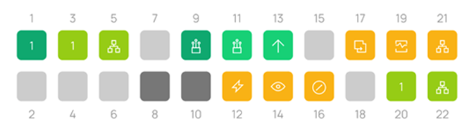
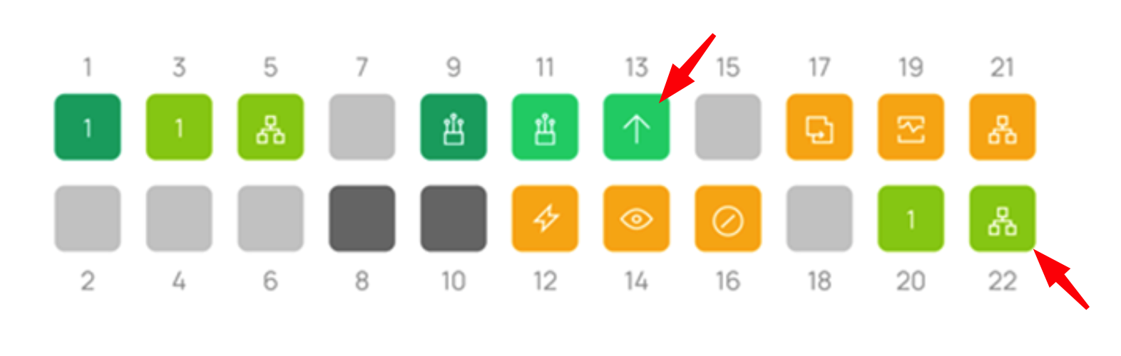
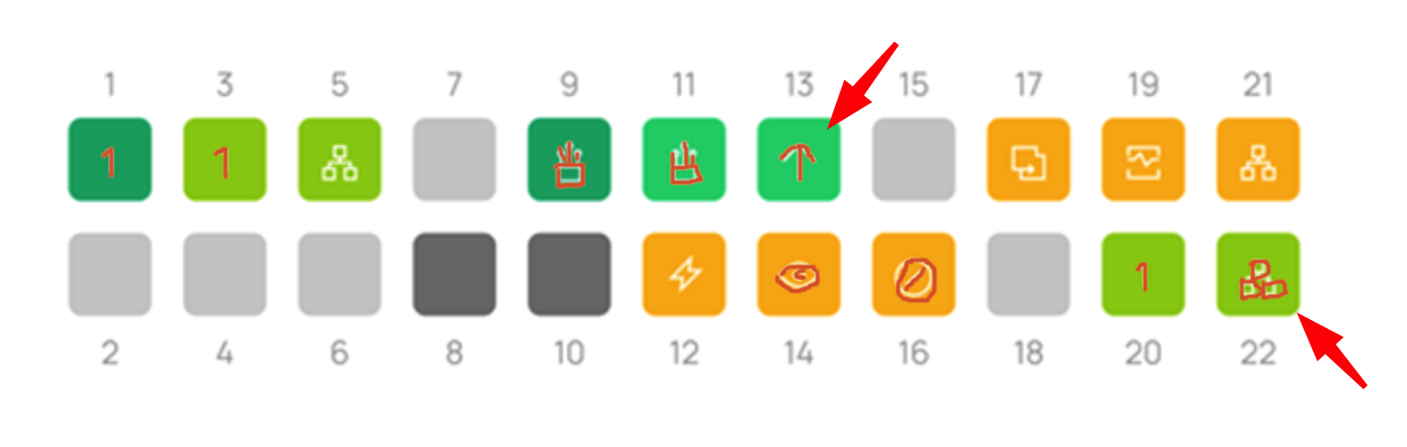
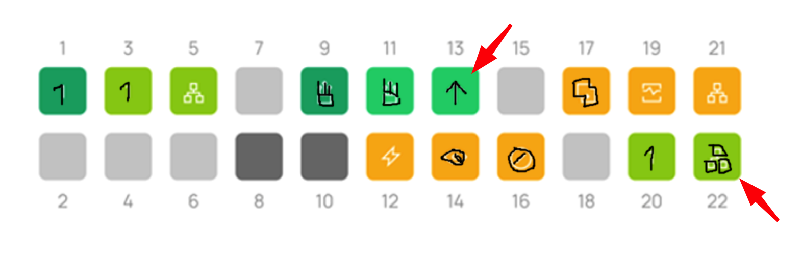
I would like to request a change of the port indicator symbols.
Since 5.14, the ports displayed on switches and routers changed colours, and are considerably brighter than they were before. This is fine, but a white "inner" indicator for STP block or Uplink is almost impossible to see, especially on 1gig ports
I would like to request that these are either changed to a more visible colour (eg, BLACK on the brighter colour ports) or we return to the old pre 5.14 colours
Indicated is a STP blocked port. Its very hard to see for thsoe of us with not-perfect vision
- Copy Link
- Subscribe
- Bookmark
- Report Inappropriate Content

Hi @GRL
Thank you for your feedback. I have forwarded your suggestions to the relevant department. Thanks for bringing this to our attention.
- Copy Link
- Report Inappropriate Content

Hi @GRL
Thank you for your feedback. I have forwarded your suggestions to the relevant department. Thanks for bringing this to our attention.
- Copy Link
- Report Inappropriate Content
Hi @GRL
This is how the ports look like in the next firmware of Omada controller, you may have a look and let me know if this is good for you:
- Copy Link
- Report Inappropriate Content
This seems better, the brightness of the green is somewhat toned down. I think i would struggle with these less, but i feel the inner symbols would benefit from being, say, a dark-ish Red? this would make them stand out more on all colours i feel. But, other people may not like that, im just basing it on my vision..... I would be interested to hear others opinions. However, overall this does seem much better!
edit: also - new symbols, interesting!
- Copy Link
- Report Inappropriate Content
Here is my highly artistic mockup of red inner symbols.
And one for black
Im not sure
- Copy Link
- Report Inappropriate Content

Information
Helpful: 4
Views: 191
Replies: 4
Voters 3


