confusing UI ER605
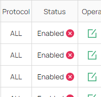
the Status buttons have a confusing icon in relation to their state.
- Enabled has a Disabled icon (not confirming)
- Disabled has a Enabled icon (confirming)
it would make sense to reverse the icon and disaplay the button as an actual button (label: enable og disable) OR use a Checkbox to indicate their state.
[x] Enabled
[ ] Disabled
- Copy Link
- Subscribe
- Bookmark
- Report Inappropriate Content

Hi @MartinKirk
Thanks for posting here.
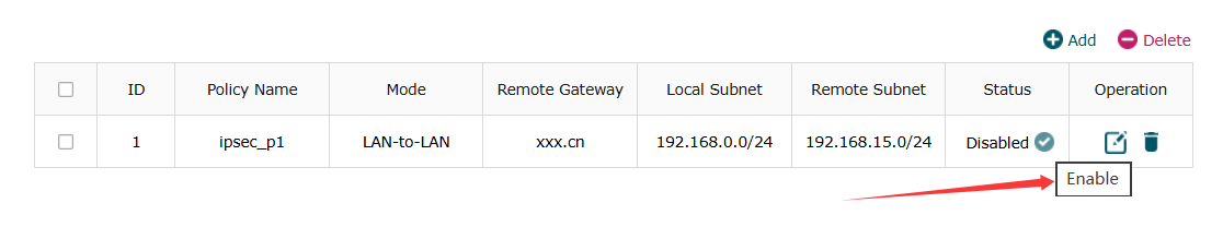
That is not a status indicator, but a button to quickly disable or enable the rule. Hover your mouse over it for 2 seconds to see it. like below:
- Copy Link
- Report Inappropriate Content
Hi @MartinKirk
Thanks for posting here.
That is not a status indicator, but a button to quickly disable or enable the rule. Hover your mouse over it for 2 seconds to see it. like below:
- Copy Link
- Report Inappropriate Content
It's still confusing , and the column says "Status" , so whatever is in the cell is indicating the status of the running service :)
it's only a suggestion for improving the UI / UX.
- Copy Link
- Report Inappropriate Content
Hi @MartinKirk
Indeed. I would send feedback to move this option to the “Operation” column on the right. The R&D will consider it.
Thanks for your suggestion.
MartinKirk wrote
It's still confusing , and the column says "Status" , so whatever is in the cell is indicating the status of the running service :)
it's only a suggestion for improving the UI / UX.
- Copy Link
- Report Inappropriate Content
Information
Helpful: 0
Views: 140
Replies: 3
Voters 0
No one has voted for it yet.