1
VotesImproved Temperature and Humidity Graphs
Improved Temperature and Humidity Graphs
Hello,
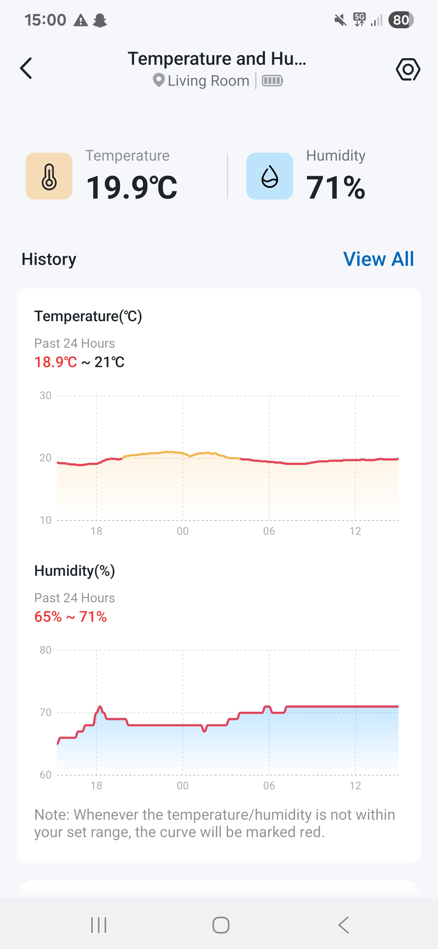
There is so much wasted space on the thermal and humidity graphs that it ruins the experience. I bought a H100 and Tapo 315 to monitor the temperature in my room throughout the day and observe the history. However 90% of the space on the graph is wasted as the y limits are sey to 10 and 30. They should be dynamically changed based on the minimum and maximum temperature. It would make the graph much easier and pleasant to read. The current graph is too small to really see the temperature difference.
basically I wish for a slight visual difference by changing the size of the graphs by just changing or allowing us to change the y axis limits in the settings or just dynamically changing them. I attached a photo showing the issue below.