Option to Enable 'Classic' Energy Usage View on KP125M Smart Plugs
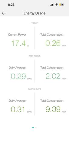
I’ve been a long‑time user of your KP115 smart plugs and have always appreciated the clean, unified energy usage screen. Having the real‑time wattage and the kWh usage data displayed together on a single page makes it incredibly easy to monitor and understand my energy consumption at a glance.
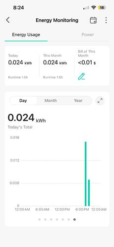
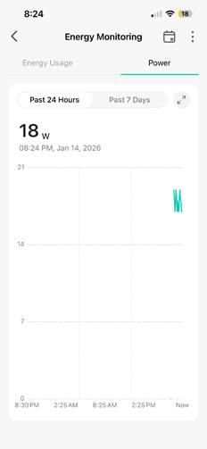
I recently purchased several KP125M smart plugs and noticed that the energy usage interface is split into two separate tabs. While I understand this may be part of a newer design direction, the separation makes it less convenient to quickly review all relevant energy data in one place.
I’d love to request an optional feature that allows users to toggle between the “classic” unified energy usage view (as seen on the KP115) and the newer tabbed “advanced” view on the KP125M. This would give users flexibility to choose the layout that best fits their workflow and preferences.
Having both views available would make the KP125M experience feel more consistent with earlier Kasa products while still supporting the newer interface for those who prefer it.
Thank you for considering this enhancement — it would make a big difference for users who rely on your energy monitoring tools daily.